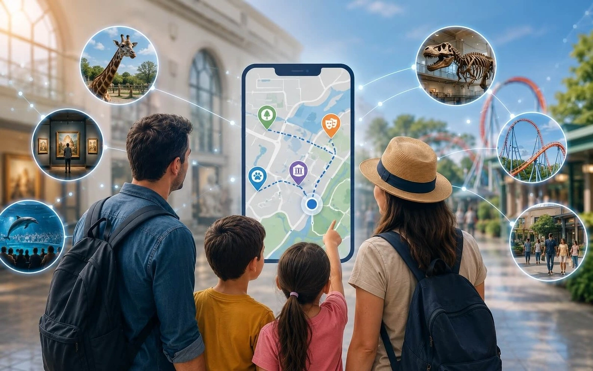
A better mobile visitor experience is not the one with the longest feature list. It is the one that makes the visitor’s next decision easier.
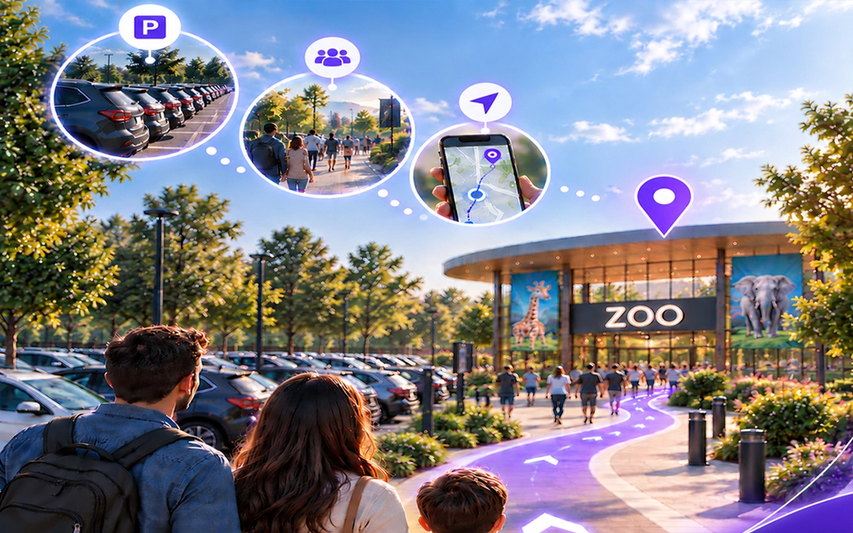
Imagine a parent arriving at a zoo with two children at 10:05 a.m. The ticket line is long, the paper map is hard to follow, and by the time they get oriented, the family has already missed the penguin feeding.
Now picture the same visit with a connected mobile experience. The night before, tickets are already on the phone. At the gate, one scan gets the family in. A simple Today view shows the next feeding nearby. When someone gets hungry, the app surfaces the closest practical option instead of asking the family to search through a directory.
The zoo did not add a dozen flashy features. It reduced friction at the moments that mattered.
For zoos, museums, parks, and destinations, that distinction matters. When visitors struggle to find what is relevant, they can miss experiences, spend time searching, ask staff for routine help, or leave with a weaker impression of the visit. Yet many organizations respond by adding more functionality when the real opportunity is to create a better digital journey.
The distinction is important: the mobile visitor app is the interface. The mobile visitor experience is the broader journey created when maps, content, schedules, navigation, recommendations, and on-site context work together. The app succeeds when the physical visit becomes easier – not when the screen becomes busier.
THE APP IS THE INTERFACE. THE EXPERIENCE IS THE JOURNEY.
The Business Problem: More Technology, Same Friction
Most visitors already carry the device needed for a digital experience. The challenge is not access to a smartphone. The challenge is context.
A visitor standing inside a 50-acre zoo has different needs from someone planning at home. A family moving through a museum has different questions from someone browsing the website the night before. A conference attendee between sessions has different priorities from someone studying the agenda a week earlier.
During the visit, people keep making small decisions: Where do I go? What is worth seeing? What is nearby? How much time do I have? What can I realistically do next?
When those answers are scattered across screens, maps, signs, websites, staff, and disconnected systems, the mobile experience can become another layer of work instead of a layer of help.
A 2025 Curator: The Museum Journal study described museum apps as mediators between visitors, digital information, and the physical museum space. It found that visitors primarily interacted with museum apps during the visit and emphasized design choices that support engagement with the physical experience rather than pull attention away from it.
Why Feature-First Apps Create Digital Displacement
The traditional conversation often starts with a feature list: maps, schedules, exhibit information, notifications, events, directions, search, tickets, and more.
Those capabilities can be useful. But features do not automatically create a journey.
A map can show where an exhibit is. It does not automatically tell the visitor whether that exhibit fits their interests, time, location, or current path.
A schedule can show that something starts at 2:00 p.m. It does not automatically help a visitor decide whether to leave the current experience, cross the venue, and arrive on time.
A content library can make information available. It does not automatically make the right information easy to discover in the moment.
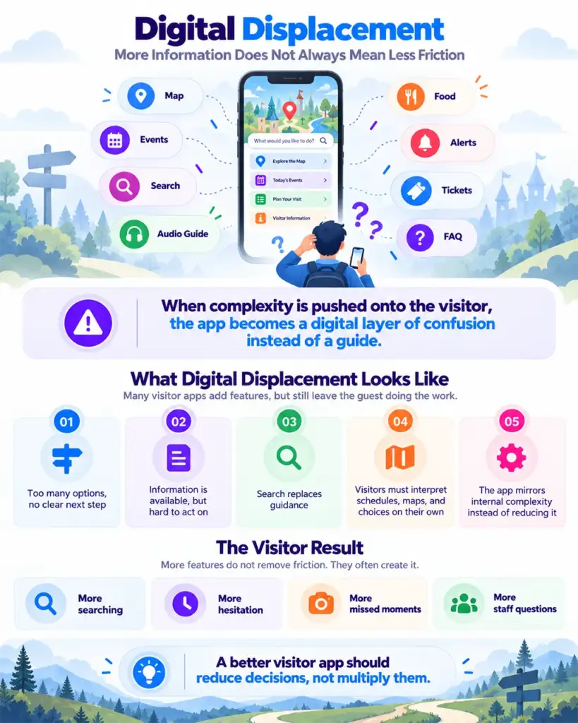
We call this digital displacement: moving complexity from the organization onto the visitor’s screen instead of removing it.
FEATURE-FIRST | VISITOR | OUTCOME |
Maps | “What should I do next?” | More information DIGITAL DISPLACEMENT |
A 2026 critical review of a century of museum visitor research reinforces why this matters: visitor path choice influences what people see, do, learn, and experience. The review also discusses mobile access, digital signage, indoor location technology, and AI as potential wayfinding aids.
So the better question is not: “What features should our mobile visitor app have?”
Ask instead: “What decisions should become easier for visitors?”
The Mobile Visitor Experience as a Decision Layer
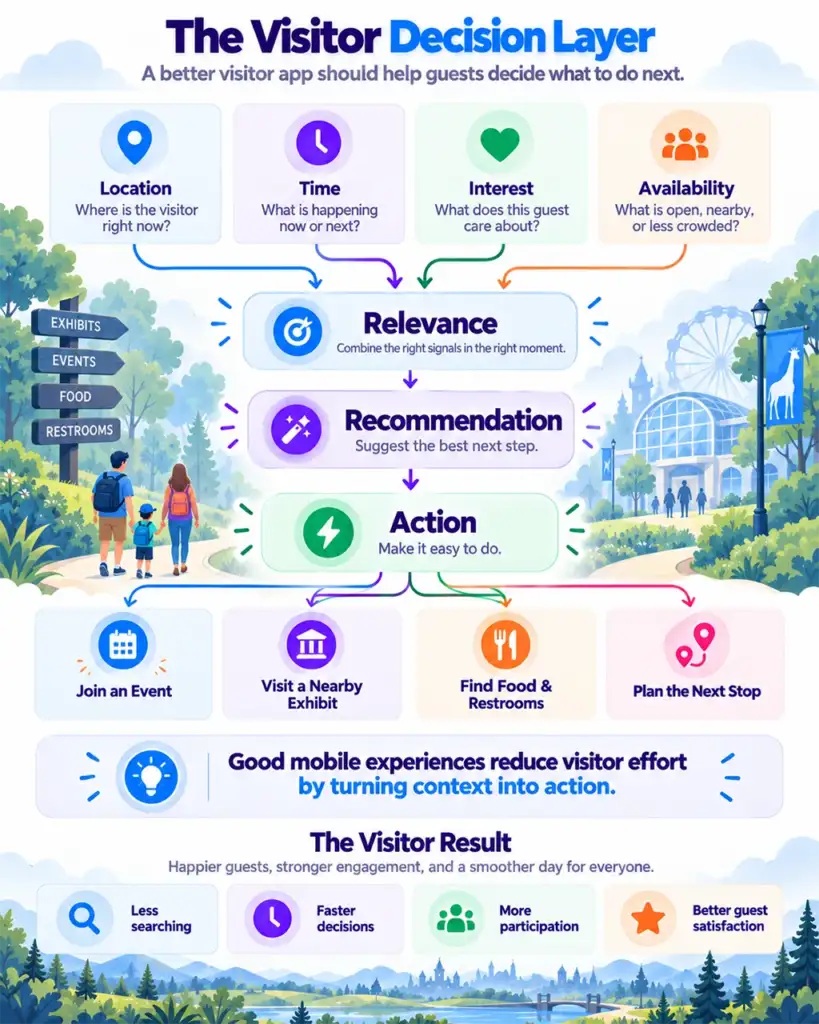
Think of the mobile experience as a decision layer for the physical visit. Visitors should not have to understand the systems behind it. They simply need relevant help at the right moment.
Imagine a family arriving at an aquarium with two hours available. They are interested in marine animals, have a young child with them, and want to see a feeding experience. The useful digital experience is not a list of everything available. It is a decision layer that connects context, relevance, recommendation, and action.
| 1 CONTEXT Where am I? How much time do I have? | 2 RELEVANCE What matters to me right now? | 3 RECOMMENDATION What should I consider next? | 4 ACTION How do I get there or participate? |
The Best Mobile Experiences Reduce Decision Effort
A useful test for any mobile visitor app is simple: Does this make the visitor’s next decision easier?
If visitors have to open multiple menus, search repeatedly, interpret complicated maps, switch between systems, or work out which information applies to them, the organization has transferred complexity to the visitor.
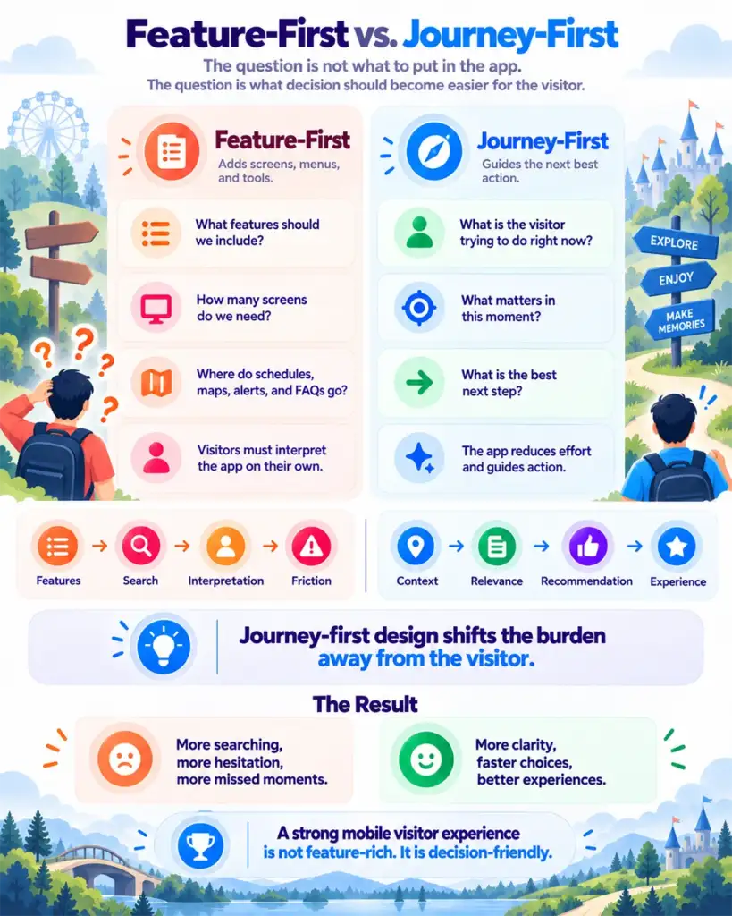
FEATURE-FIRST | JOURNEY-FIRST |
“Here is a map with 100 points of interest.” | “Here are three relevant things near you.” |
“Here is today’s complete schedule.” | “You have 30 minutes. This starts nearby in 10.” |
“Here are all available routes.” | “Here is the easiest practical route from where you are now.” |
The technology may be sophisticated underneath. The experience should feel simple on top.
A 2021 usability study of mobile tourist-guide apps reached a related conclusion from a different angle: usability depends not only on having capabilities such as maps, points of interest, current location, and offline access, but also on presenting information clearly and reducing ambiguity for the user.
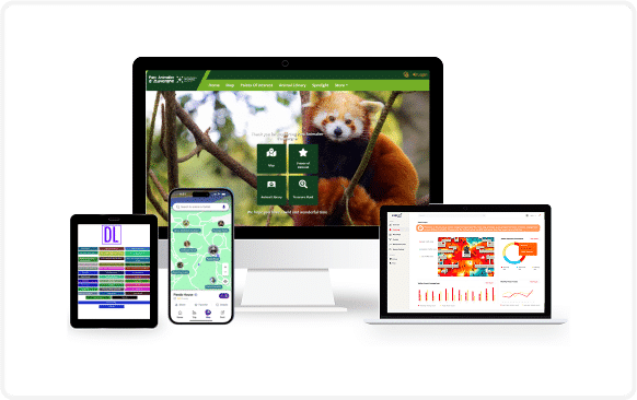
What This Looks Like Across Visitor Industries
SETTING | VISITOR QUESTION | WHAT A JOURNEY-FIRST EXPERIENCE CAN DO |
Zoos & Aquariums | What should we see next? | Use location, timing, family needs, and nearby programming to surface a practical next experience instead of making visitors scan a full schedule. |
Museums & Science Centers | What is relevant to my interests and available time? | Use location-aware content, exhibit discovery, and route guidance to help different visitors navigate the same physical space in different ways. |
Theme & Water Parks | What can we realistically experience next? | When reliable queue, schedule, and availability data exist, use those signals to suggest practical nearby alternatives rather than forcing visitors to compare everything themselves. |
What is worth discovering nearby? | Connect places, trails, stories, businesses, and routes into one visitor-facing journey that makes the surrounding destination easier to explore. |
The examples above describe design patterns, not guaranteed outcomes. The quality of the experience depends on the accuracy of the underlying data, integrations, location signals, and implementation.
How Do You Know the Digital Journey Is Improving?
A better digital journey should be measurable. The exact metrics will vary by venue, but leadership should be able to connect digital behavior with operational questions rather than count app downloads alone.
SIGNAL | QUESTION IT HELPS ANSWER | EXAMPLE MEASURE |
Search friction | Are visitors searching without finding what they need? | Search-no-result rate; repeated searches |
Navigation friction | Are people repeatedly reopening maps or rerouting? | Map reopen rate; repeated route requests |
Discovery | Are visitors finding experiences they did not already know about? | Event/exhibit discovery clicks; unplanned-discovery survey response |
Engagement | Are recommended experiences leading to meaningful interaction? | Content, tour, NFC, event, or route engagement |
Staff demand | Are routine directional questions still absorbing frontline time? | Staff observations or sampled question volume |
Visitor feedback | Does the journey feel easier to visitors? | Wayfinding ease; satisfaction; qualitative comments |
The point is not to measure every tap. It is to understand whether the digital layer is actually reducing friction and helping the physical visit work better.
Why Decision Friction Matters to the Business
Reducing decision friction can affect more than visitor satisfaction. When visitors can more easily discover dining, retail, events, exhibits, tours, and other experiences relevant to where they are, organizations create more opportunities for participation and secondary spend. Contextual guidance can also help distribute visitor attention across a venue by suggesting suitable alternatives when high-demand areas are crowded or temporarily unavailable.
These outcomes should be measured, not assumed. The business case becomes stronger when digital behavior is connected to operational measures that matter to the venue.
BUSINESS QUESTION | WHAT TO OBSERVE |
Participation | Event/tour views, starts, check-ins, reservations, or other participation signals where available. |
Secondary spend | Food, beverage, retail, ticket, or membership click-throughs and order/conversion starts where systems are integrated. |
Capacity distribution | Engagement with alternative zones, routes, exhibits, or nearby recommendations when high-demand areas are busy. |
Staff efficiency | Directional questions, help-desk requests, or sampled frontline inquiry volume before and after the intervention. |
Executive Takeaways
- A mobile app is not the visitor experience. The experience is the physical journey the visitor has while using it.
- Information creates value when it helps a visitor make a better decision in context. Relevance matters more than volume.
- Wayfinding is both a visitor-experience and operational issue. Confusion can cause missed experiences and create avoidable demand on staff.
- Context should shape the digital experience. Location, time, interests, availability, and visitor intent can turn information into useful guidance.
- The goal is not more screen time. The goal is a better physical experience with less digital friction.
The Pigeon-Tech Perspective
Pigeon-Tech approaches the mobile visitor experience from the visitor journey outward.
The question is not: “How do we build another visitor app?”
It is: “How do we make the physical visit easier by using digital context at the moments it matters?”
That means working with the systems an organization already has where practical instead of assuming that improvement requires replacing everything. A connected experience can bring information from maps, schedules, content, ticketing, membership, events, and on-site interactions into a more useful visitor-facing journey.
Integration should match the visitor problem. Where existing ticketing, POS, CRM, membership, event, or content platforms expose usable APIs, feeds, or web services, selected information can be surfaced in the mobile visitor experience without replacing the underlying system. Where a full API integration is unnecessary, lightweight links or embedded experiences may provide a practical first step. The goal is to use the least complex integration that reliably supports the journey.
The result should not feel like visitors are interacting with more technology. It should feel like they are spending less time figuring things out and more time experiencing the place.
Five Questions to Ask Before Adding Another Mobile Feature
- Where do visitors experience the most friction today?
- Which decisions are they repeatedly asking staff to help with?
- Where are visitors missing experiences they would likely value?
- Which existing systems already contain information that could make the journey more relevant?
- Can we test improvement in one high-friction journey before expanding?
Organizations do not need to rebuild their entire digital infrastructure at once. Start with one high-friction journey – for example, entry, event discovery, or wayfinding – define measurable signals, and run a focused pilot. The objective is to learn whether the intervention reduces friction and whether broader investment is justified.
The starting point is not a demo of every capability. It is one visitor journey worth improving, one set of measurable signals, and one focused test that can show whether the experience became easier.
FIND ONE VISITOR JOURNEY WORTH FIXING
Request a Visitor Journey Assessment | Explore a Focused Proof of Concept
Start with one friction point, define what success looks like, and test before scaling.
Frequently Asked Questions
A mobile visitor app is the interface a visitor opens on a phone. It may provide maps, content, schedules, tickets, recommendations, and guidance. Its value depends on whether those capabilities work together to make the physical visit easier.
It can reduce searching and navigation friction, make relevant experiences easier to discover, help visitors use their available time more effectively, and connect digital information to the physical place they are exploring.
Because it can make existing programming and information easier to discover, reduce avoidable wayfinding friction, give teams better signals about digital behavior, and potentially reduce some routine directional demand on frontline staff.
Prioritize visitor decisions, not feature count. The experience should make common questions easier to answer: Where am I? What is relevant? What should I do next? How do I get there?
The app is the interface. The mobile visitor experience is the broader journey created when maps, content, schedules, recommendations, navigation, existing systems, and on-site context work together around the visitor’s needs. A strong experience is measured by what becomes easier in the physical visit, not by how many features appear on the screen.
Often, yes. A connected experience can work with existing systems by bringing selected information into a clearer visitor journey. The appropriate approach depends on the quality of the underlying systems, data access, and integration options.
Start with one specific visitor problem, define measurable outcomes, test a focused intervention, and use the results to decide where broader improvements are justified.